- DATE:
- AUTHOR:
- The OfficeRnD Team
- RELATED ROADMAP ITEMS:
- Visual uplift of the Member Portal
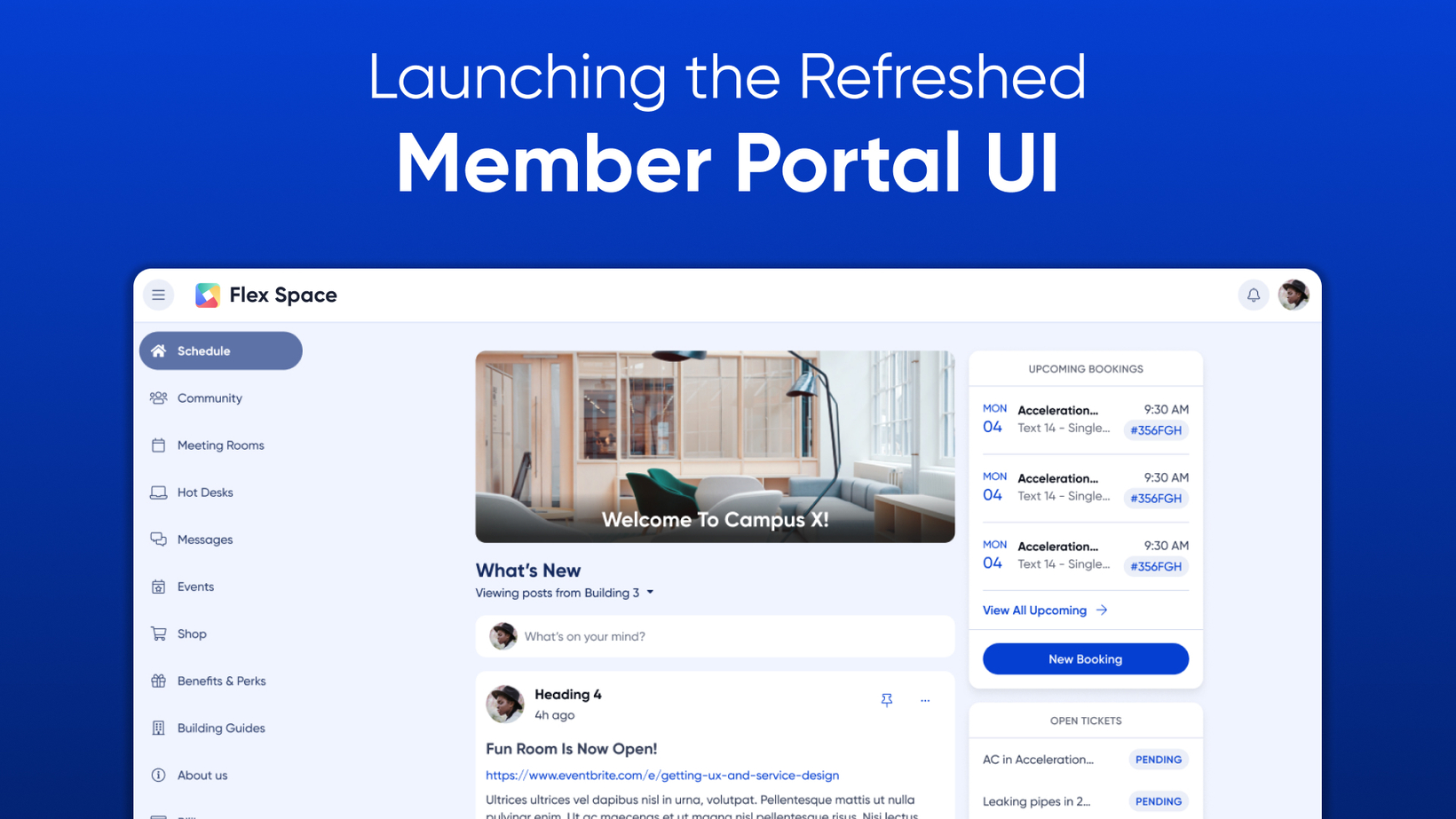
Member Portal Visual Refresh
We are thrilled to introduce a fresh new look for the Member Portal! This update gives Members a more modern and visual user interface, enabling operators to easily show their brand colors and customize the Member Portal to their liking.
Because we know humans are creatures of habit and change can be scary, we wanted to be very clear. There are no changes to placement or functionality—everything is staying exactly where it is. What’s shipping is a refreshed and refined UI and design system we know your Members will appreciate.

A Refreshed Member Portal Experience 
The Member Portal Refresh focuses on:
Common elements like navigation menus, user menus, and action buttons now have more consistent modern styling and presentation
Clean, minimalist aesthetic for clarity: we're using white space, clear hierarchies, and thoughtful typography to guide Member focus to the most important content and actions
More reactive modules and components for screens of all sizes
The result is a win-win! An intuitive, uncluttered interface that gets out of your way, making it easier to utilize useful functions of the portal. And implementing the updated design system and standardizing components (layout, navigation, buttons, icons, color, fonts) creates a consistency and foundation for all future Member Portal experiences.
Brand your Portal with Ease 
The team has built an updated Member Portal branding menu located in Settings / Member Apps / Branding. Operators can select the "Modern OfficeRnD Theme" button to begin customizing the portal to match their brand image. With our updated settings menu, operators are able to easily to get a visual preview of what their branding changes will look like before they deploy them to all members.

Operators have the ability to modify a few essential colors for their member portal and mobile app through an RGB color picker.
Background Color - changes the color of the background of the Member Portal
Primary Color - changes the default color of buttons in the portal and your Branded Mobile App color
Navigation Color - changes the color of the main navigation menu on the left sidebar
Mix and match different colors to see what looks the best to showcase your brand! You can take a look at the new portal customization and theme preview below:

We also now give operators the ability to add Custom CSS Code directly from the branding page providing them with greater control over the configuration of their portal. Additionally, the team has improved the settings menus for Favicon and Hero images to make it clearer for operators as they make adjustments.
All of these these updates aim to simplify the customization process, allowing operators to seamlessly align their portal with their brand identity. Our team is excited to see how operators refresh their portals using the new Modern Theme! As always, reach out to our team at support@officernd.com with any questions related to the update!

Let us know what you think! 
Don't forget - we wanted to remind you that our annual FlexWorld event is just around the corner this November 1st! Join us for a deeper look at the new Member Portal UI and explore our flex roadmap further!

What do you think about the new Member Portal UI? Leave feedback on our dedicated Flex Updates Page and keep us posted on how we can further improve your OfficeRnD experience.